With my Nature and Decay pictures I tried to interpret the Decay side and portray this in a interesting, spooky way.The images would be an exebition so the editing had to be subtle. I mainly darkened pictures and cropped them to focus on points in each image.
For my school brochure photo's I attempted to show off the school as a bright unified community, by making the pictures bright and full of colour, but also tried to give the school a modern look.These photo's would be used for a school brochure so this meant making the images bright to make them stand out.
The photos for my photo essay are based on health and fitness. I took pictures of food and people doing exercise intending that they would be used for a fitness sight or health magazine or brochure. I made these images bright and colourful to look at, this makes people looking at the images want to read the magazine or brochure.
I was intending to make all my images to be clear, unpixelated and to fit their purpose. I tried to make some of the editing to the images like the school brochure and photo essay subtle, this makes the images more realistic and relatable.
During this process, taking the pictures and editing them on photoshop is what i enjoyed the most, this was because it was fun and creative and it was interesting to learn how to work photoshop.
I least enjoyed annotation and presentation this was because I didn't have a lot to write because i tried to minimize the amount of editing and i also couldn't work the flickr where i made the slideshow and this made me confused and i wasn't confident to work it.
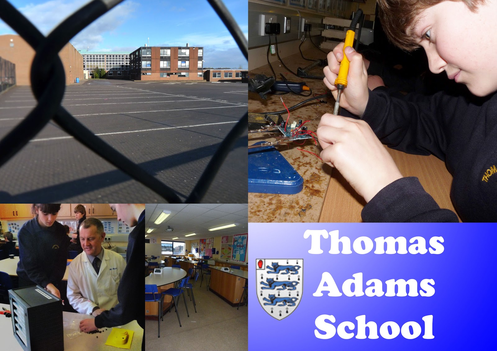
My best image is my one of the student working on a piece of work because it shows the creative side of the school and what a child would be doing if they were to attend the school. I edited the picture to brighten the background and also blur it to focus more on the student. The picture is bright and interesting to look at. This image is similar to one in the current school brochure and this makes it seem that this image is professional enough to go on a school brochure.
My least favorite image is the one of the long shot of the school through the fence because it makes the school look trapped and caged in behind the fence, this was just an idea that maybe i could work on for next time and have the school being looked through the school gates to make it look more inviting. This image is similar to one in the school brochure we have today, their one is more inviting and looks brighter than mine, this is why i should take the image of the school but take it without the fence to still show the whole school and its surrounding but without the uninviting fence in front.
By looking at professional images it helped me improve my skills and look at my images differently. Also by trying out different ways of taking images, for example cropping, simplifying the scene and avoiding the middle.
When editing the images i played around with different techniques in photoshop to try and learn how to work it better. I also looked at my teachers tutorials to help explain exactly what to do and get on with editing my images. My friends also helped my when i was stuck with a problem in photoshop and they knew it better than me.
I presented my work in different ways to separate them. I used flickr, youtube and photoshop image to present my images. My teacher also advised that these ways of presenting my work would look the best.
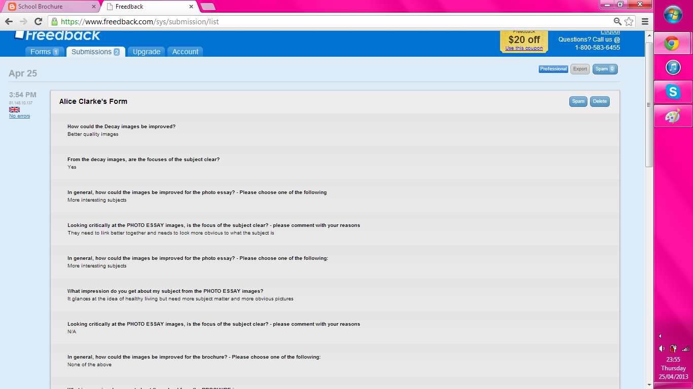
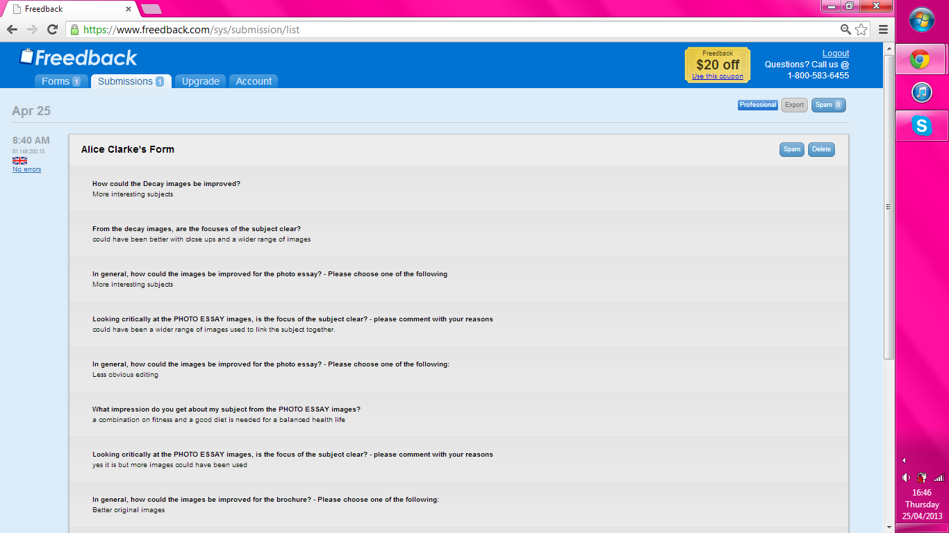
I used a web page called 'Freedback' to make a questionnaire about my images to put on my blog so people could tell me what the saw when looking at them.
The feedback about my images helped me understand what people thought of my pictures. It also reassured me that some of the ideas i thought hadn't worked well, had not but also had some suggestions on how i could fix it next time, for example the fence in front of the school image.